Which locations face greater fire danger, and how does that change each day?
Analysis updated October 15, 2026
Crosswhite was discovered in Wheeler County, Oregon, at 5:51 p.m. PDT on July 15, according to NIFC. A later FLARE reconstruction places the cell nearest its reported starting point in the Very high fire-danger category for that day.
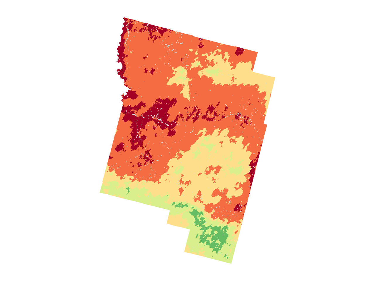
The county maps tell a wider story. About a quarter of Wheeler County was rated Very high or Extreme on July 13. By July 14, that share had grown to nearly three fifths.
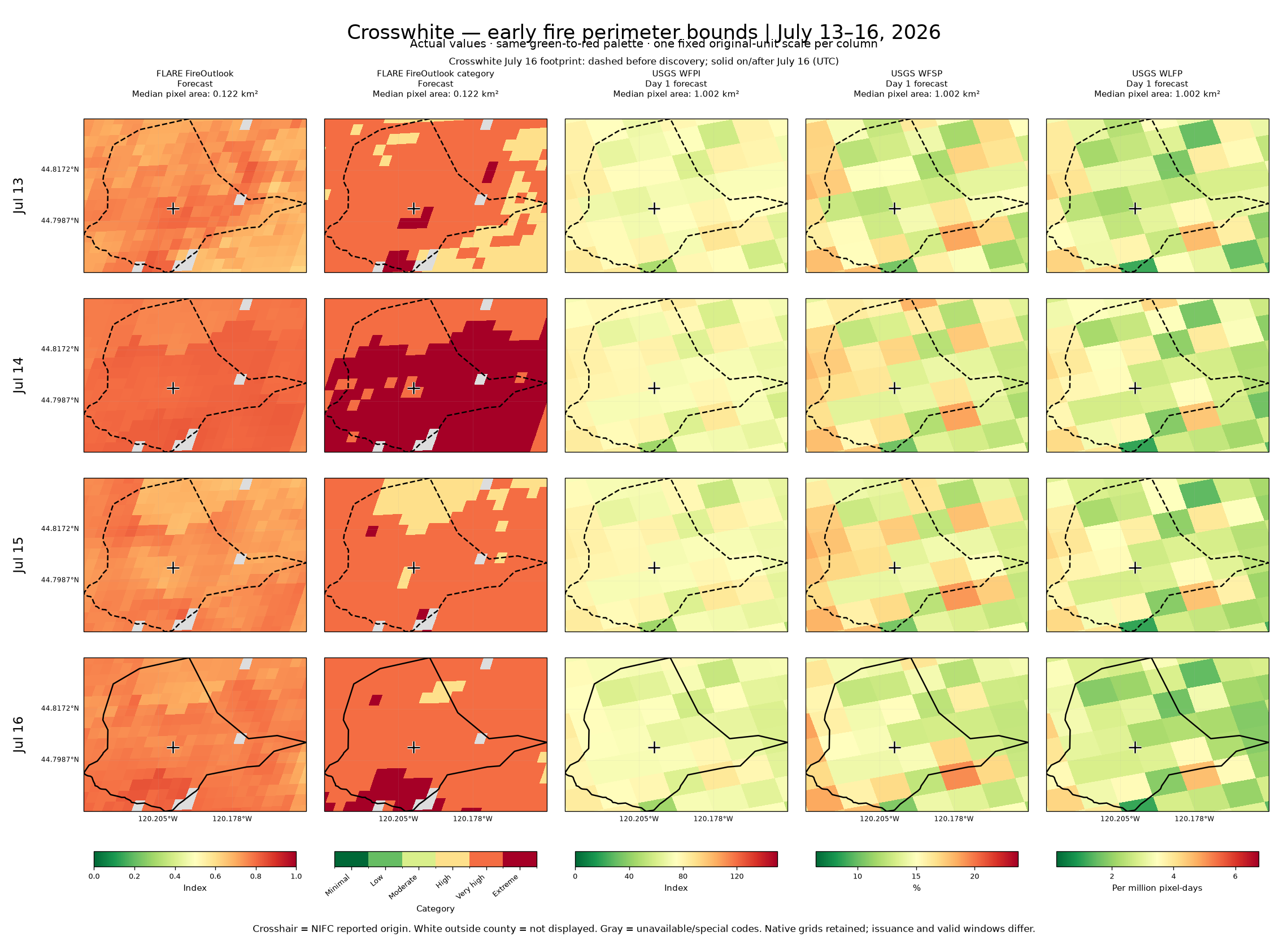
The maps below follow that change from the county as a whole to the land around Crosswhite, with three USGS forecasts alongside for comparison.
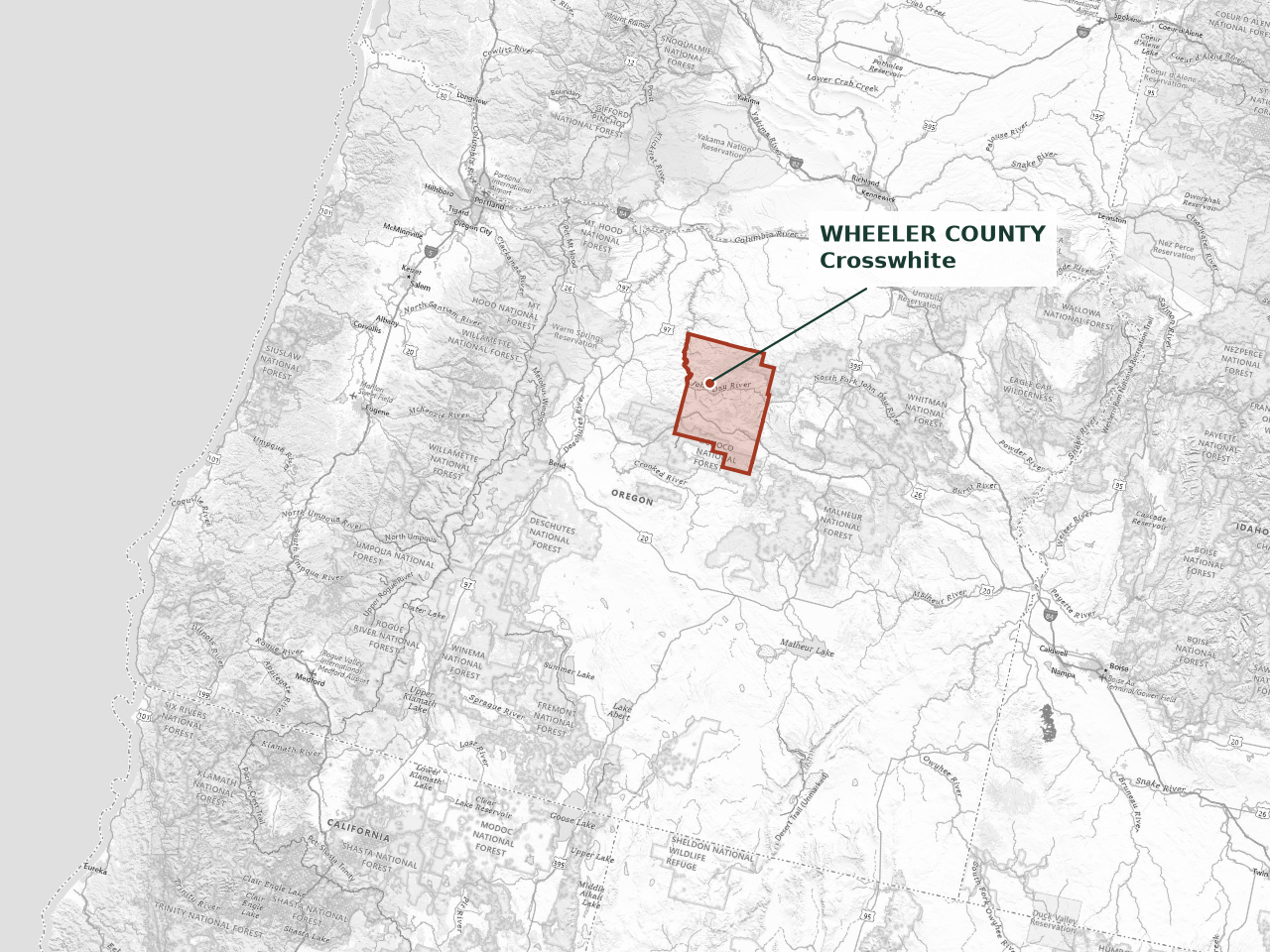
Wheeler County lies in north-central Oregon. The outline on this map locates the county; the dot marks Crosswhite’s reported starting point.
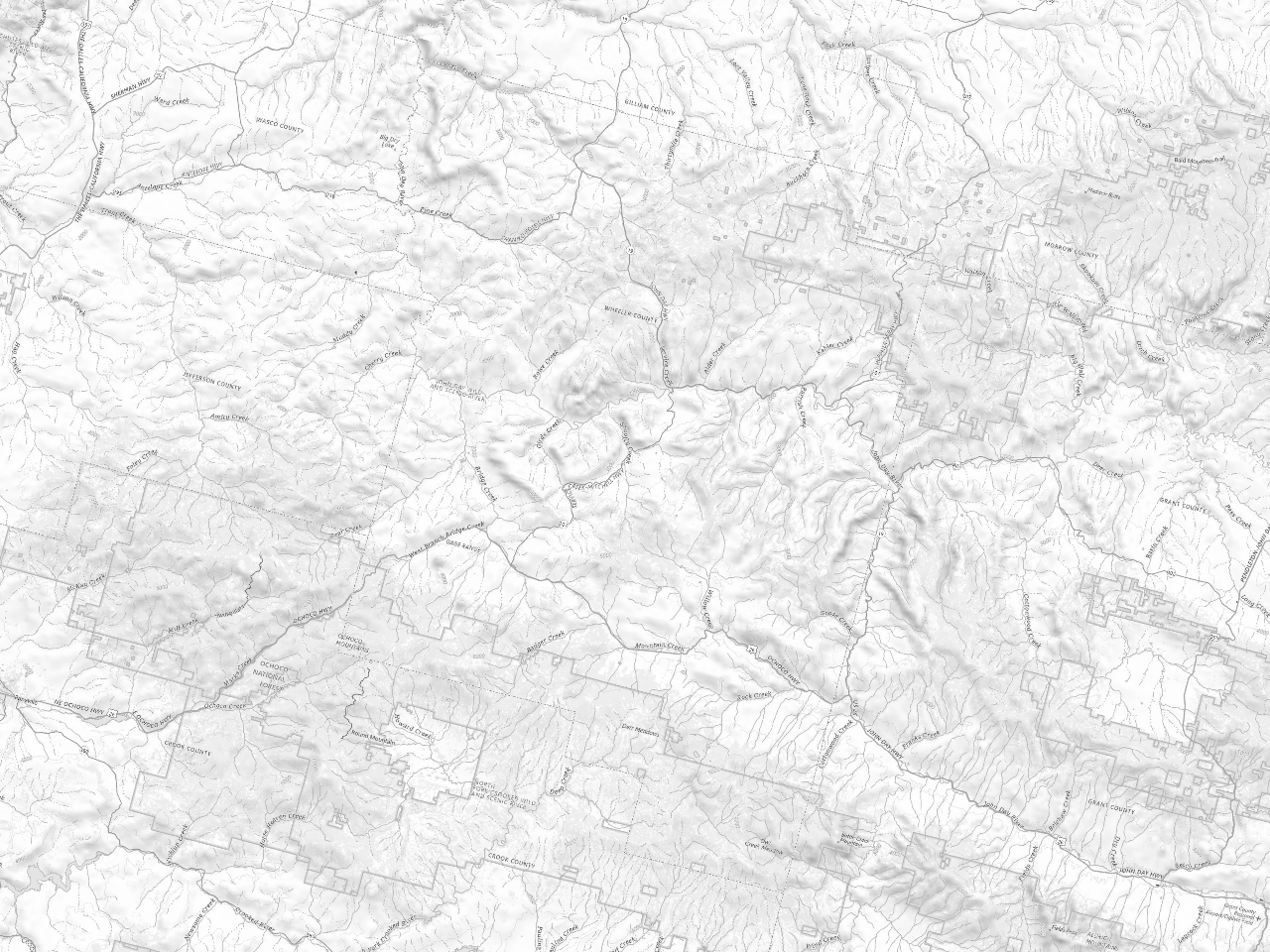
The maps below bring roads, rivers, and nearby communities into view alongside the daily fire-danger forecasts.
01 / THE COUNTY
A sharp rise between July 13 and 14.
By July 14, FLARE rated about 2,659 km² of Wheeler County Very high or Extreme. The area had more than doubled in a day, expanding by roughly 1,539 km².
Gray: unavailable or special land/status codes July 16 Crosswhite footprint, shown as a reference
JULY 14
59.8% of the county rated Very high or Extreme / 2,659 km²
97.8% valid FLARE coverage
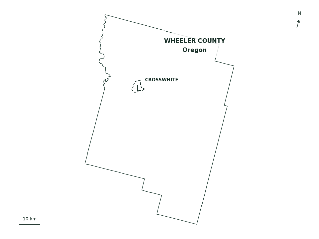
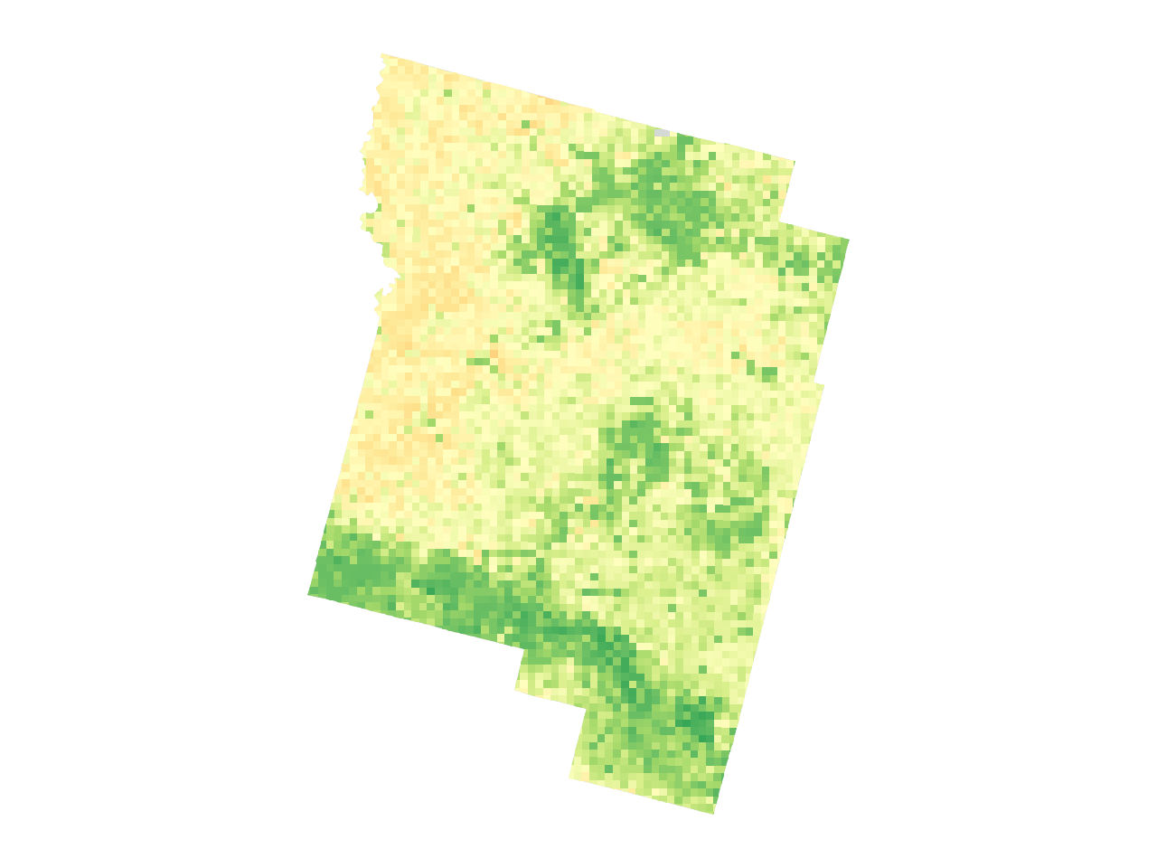
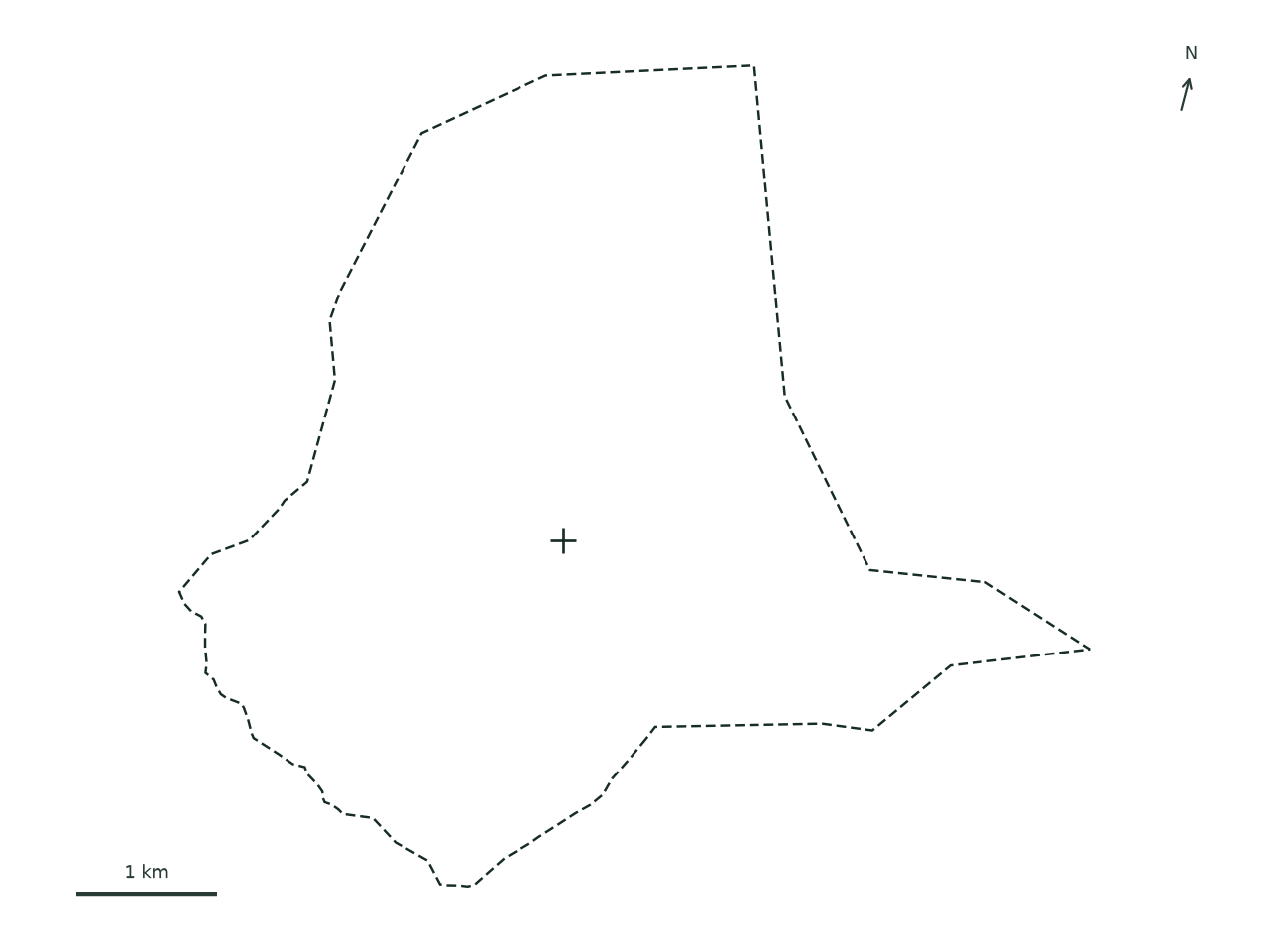
The solid outline follows Wheeler County’s administrative boundary, with forecast colors shown inside it. The smaller dashed outline marks Crosswhite’s early fire perimeter. Both maps cover the same area at each product’s original grid resolution, with separate scales and units below.
THE LONGER VIEW
The wider July pattern.
Elevated danger was already widespread earlier in July. The four days around Crosswhite sit within a series of rises and falls. By July 20, the county’s share rated Very high or Extreme had fallen to 4.1%.
County area rated Very high or Extreme % of the entire area within the county boundary
July 13–16Total county area is the reference for every day.
THE SIZE OF A CELL
A closer view of the same ground.
A typical FLARE cell in this county covers about 0.122 km². The USGS cells cover about 1.002 km². A single USGS cell therefore covers roughly 8.2 times as much area.
Smaller cells bring more of the county’s local variation into view. Around Crosswhite, that detail helps show how the index changes across the land within the early fire boundary.
FLARE0.122 km²
USGS1.002 km²
Squares show the relative area of a typical cell, using median values. The map cells follow the shapes of the original grids.
02 / CROSSWHITE, UP CLOSE
A closer look at Crosswhite.
Crosswhite’s recorded discovery came at 5:51 p.m. PDT on July 15. For the 24-hour period beginning that morning, the FLARE reconstruction rates the cell nearest its reported starting point Very high.
Across this footprint, FLARE’s smaller cells show how the index varies from one part of the area to another.
03 / READING THE COMPARISON
What each map tells us.
FLARE describes fire danger. The USGS products add three views: vegetation flammability, the chance of an existing fire becoming large, and the likelihood of a new fire that eventually grows large.
ProductThe question it addressesHow to read it
01
FLARE FireOutlook
Where does FLARE show greater fire danger?
A unitless 0–1 danger index with six categories. Higher scores indicate greater danger. In this analysis, 0.80 marks the start of the Extreme category.
02
USGS WFPI
How flammable is the vegetation?
An index on a 0–150 scale, combining information about vegetation and weather. Higher values indicate greater flammability. USGS definition
03
USGS WFSP
If a one-acre fire already exists, what is the chance it grows beyond 500 acres?
A percentage probability of that growth. For example, 20% would mean an estimated one-in-five chance of the fire reaching more than 500 acres. USGS definition
04
USGS WLFP
How likely is a new fire that eventually grows beyond 500 acres?
Expressed per million reference pixel-days, for 1 km² cells. A value of 3 means a probability of 3 per million, equivalent to 0.0003%. USGS definition
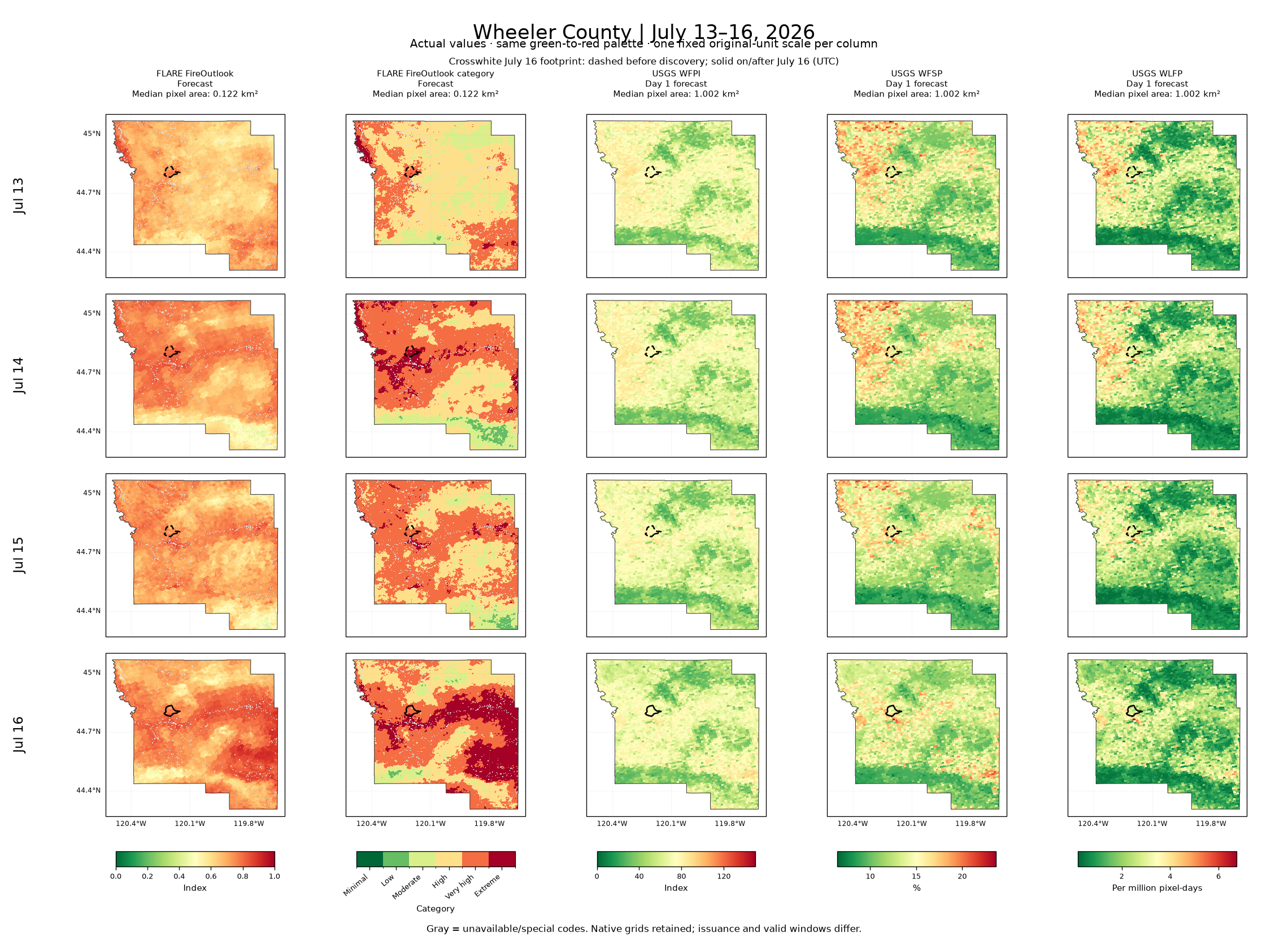
The scale stays the same from day to day. Each product keeps its own units and color scale across all four dates. WFPI uses 0–150. WFSP and WLFP use the range of values found across the county over those four days. This makes daily changes easier to follow.
All four days, side by side.
The original analysis figures include every product and its numerical legend.
The original figures label discovery by its UTC date. July 16 at 00:51 UTC falls on July 15 at 5:51 p.m. in Oregon. Incident times in this story are given in PDT.
WHAT THIS CASE SHOWS
Why the local picture matters.
For a land manager, a utility team, or an insurer, fire danger becomes a local question: what do conditions look like around the places they are responsible for? FLARE FireOutlook brings those locations into focus.
In Wheeler County, FLARE shows both a sharp expansion in the area of elevated danger and variation within the land around Crosswhite. Together, the county view and the close-up give people a way to examine local conditions while keeping the wider picture in sight.
A forecast helps a team decide where to look. Observations help them understand what is changing. FLARE brings those views together, from the county outlook to the locations that need attention.
1 / 3 · Anticipate
Plan for tomorrow’s conditions.
FireOutlook puts the next day’s fire danger beside the recent pattern. For a utility team or insurer, that local view helps focus the next day’s monitoring and exposure review.
Where should we focus tomorrow?
Wheeler County · July 15 FireOutlookJuly 14 historical replay, with the next day’s forecast selected.
Understand what is changing.
Follow thermal activity alongside vegetation greenness (NDVI), moisture (NDMI), and the daily outlook. FLARE’s five-minute observations show activity through the day; daily vegetation composites place it in context.
What changed, and where should we look closer?
Wheeler County · July 15, 7:56 p.m. PDTThermal observations over 24 hours, beside daily vegetation and outlook trends.
Give the team a clear next step.
A location-based watchlist brings recent activity, observation times, and supporting records together. Teams can investigate a location and share an assessment to guide site checks, exposure reviews, and briefings.
Which locations need follow-up?
Wheeler County · July 15, 7:56 p.m. PDTThe watchlist connects observed activity with a place to investigate. Teams use this evidence alongside official incident guidance.
These are original captures from the FLARE dashboard’s July 2026 historical replay, taken on October 16, 2026. They retain their original numerical scales and illustrate the workflow alongside this retrospective case study.
The dashboard’s percentages count eligible, scored burnable pixels rated Very high or Extreme. The county analysis above measures land area in those categories across the whole county. Each uses its own stated denominator and boundary treatment.
NDVI and NDMI here are daily composites ending at 03:00 UTC, derived from FLARE’s five-minute observations. FireTrack outlines represent observed thermal activity; NIFC/WFIGS perimeters represent the mapped fire extent. The watchlist retains the available reference-evidence status for each track. FireScore describes thermal activity and has its own scale.
Nineteen FLARE FireOutlook v11 files cover July 3–21, 2026. The map comparison focuses on July 13–16 and uses the Census BAS 2026 boundary for Wheeler County, Oregon (FIPS 41069). The source is the published analysis at commit 5e8e208.
The FLARE files were produced after the July study period as historical reconstructions. Their issue timestamps describe the forecast schedule used in those reconstructions. This story examines the resulting fields and their day-to-day changes.
How were the county percentages calculated?
Each grid cell contributes in proportion to the area it covers inside the county. Areas are measured using the EPSG:5070 equal-area projection. The percentage uses the entire 4,445.717 km² county boundary as its denominator and counts stored category codes 5 and 6: Very high or Extreme, beginning at an index of 0.70.
The downloadable table also preserves the earlier analysis fields named high_area, calculated with a strict > 0.70 threshold. The story uses the very_high_extreme_area fields, calculated directly from categories. The rounded county percentages for July 13–16 remain the same.
Valid FLARE values cover 97.762% of the county on these dates. The remaining 99.477 km² is classified as unavailable and remains part of the county total. USGS statistics use numerical measurements, with special land/status codes kept separate.
Each location has a fire-danger category. The categories follow the October 15 analysis revision and use these exact index ranges.
FLARE FireOutlook codes, categories and index ranges
Code
Category
Index range
0
Unavailable
Missing/invalid
1
Minimal
0–<0.40
2
Low
0.40–<0.50
3
Moderate
0.50–<0.60
4
High
0.60–<0.70
5
Very high
0.70–<0.80
6
Extreme
0.80–1
Each range includes its lower boundary. Extreme also includes 1. Category code 0 means unavailable; an index value of 0 belongs to Minimal. Original index values remain available in the optional Index view and source files.
Which dates and hours do the maps cover?
FLARE files carry a 03:00 UTC issue time and a 24-hour valid period from 12:00 UTC to 12:00 UTC the following day. In July, that is an 8 p.m. PDT issue on the preceding local evening and a 5 a.m.–5 a.m. PDT valid period.
The retained USGS Day 1 metadata identifies the archive and ground-condition dates. This comparison follows those daily dates. A same-hour comparison would require additional USGS issue-time and forecast-lead metadata.
Where do the origin and perimeter come from?
The reported starting point comes from NIFC/WFIGS, at latitude 44.803333 and longitude −120.199167. The discovery timestamp is July 16, 00:51:54 UTC, or July 15, 5:51:54 p.m. PDT.
The early footprint comes from the archived perimeter record (object 58164, BurnPeriod2), timestamped July 16, 16:25 UTC. That single recorded footprint provides a fixed geographic reference across all four dates. Daily point values come from the nearest native FLARE cell center, approximately 216 m from the reported starting point.
How are the maps and cell sizes drawn?
Both datasets are drawn from their original cell corners in EPSG:5070. FLARE corners are estimated from adjacent center coordinates using the source notebook’s method. USGS corners come from the retained raster geometry. Each displayed cell keeps its original numerical value and grid footprint.
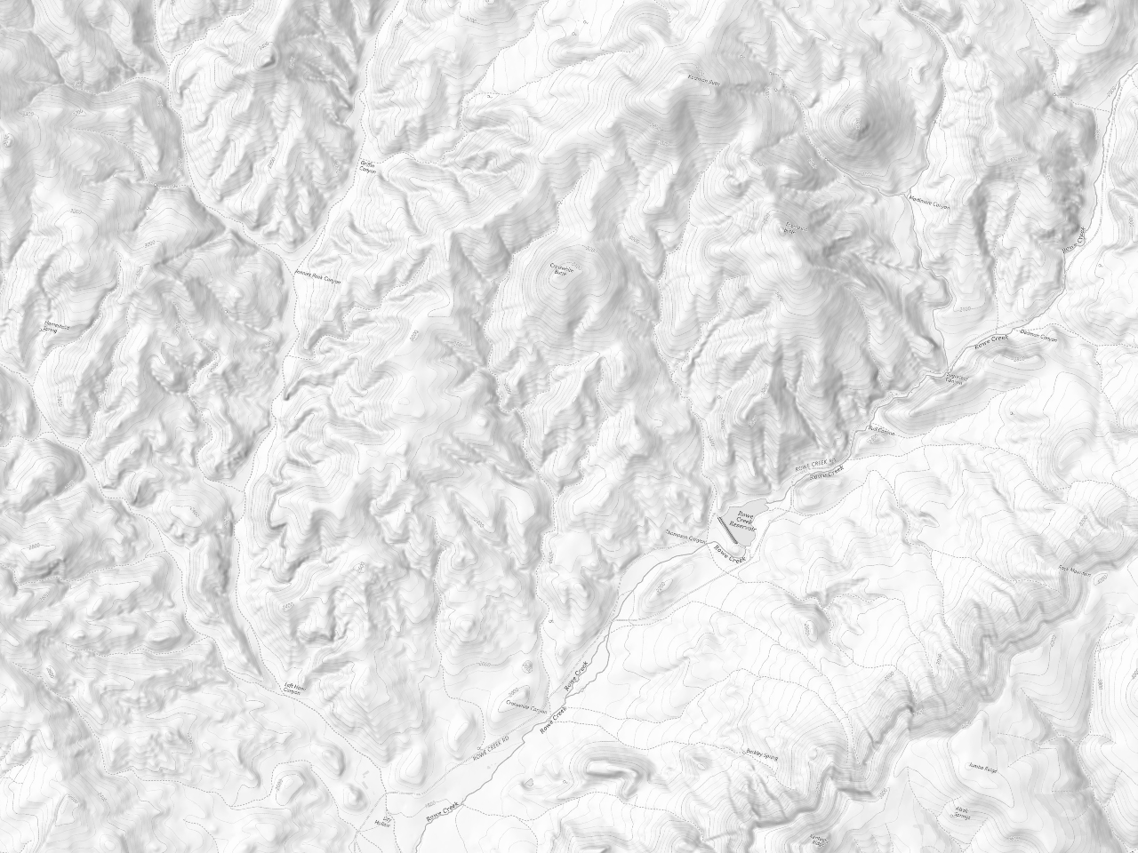
The geographic background comes from USGS Topo, exported in the same EPSG:5070 projection and displayed in light grayscale. Roads, rivers, place names, and terrain provide present-day geographic context. The forecast colors begin at 72% opacity; the opacity control also offers a full-color view and a geography-only view. The early fire boundary and origin remain visible throughout.
The 0.122 and 1.002 km² figures are median full-cell areas for valid cells intersecting the county on July 13. The 8.2 ratio expresses the difference in area covered by a typical cell. Zoom enlarges those existing cells.
What does this comparison establish?
This case study shows how mapped fire-danger values vary across Wheeler County and change from day to day. It also measures the difference in spatial detail between the FLARE and USGS grids.
Measuring comparative forecast accuracy would require a larger set of fires and control locations, matched issue and valid times, and a shared measure of performance. Those tests would establish how the additional spatial detail affects predictive skill.
Credits, files, and reuse
FLARE research and data: Manju Smriti; BRIDGE – Research and Policy Foundation; ARTH GEO Intelligence. Comparison products: U.S. Geological Survey. Incident origin and perimeter: NIFC/WFIGS. County boundary: U.S. Census Bureau.
FLARE source data carries CC BY-NC-ND 4.0. The provenance file retains source URLs, hashes, and original-figure hashes. See the included README for reproducibility and local use.
Map images need their accompanying files. Keep the assets and data folders beside this HTML file, then reload.